As a working professional with lots of interests, I have been always looking for smart ways to manage my time, my tasks and to search for information. For the sake of my Capstone project in the Interaction Design specialization in Coursera, I needed to select a topic to work on and create a mobile app prototype. I figured out that since there was no coding yet involved, I could just think freely with no constraints; I came up with an idea for a smart dashboard that would help people organize their day and use their free time smarter. The main problem I wanted to tackle was the fact that people always need to look into different apps to find updates and perform actions. With this problem in mind, I initiated the UX Design process following the steps below:
- User interviews: Keeping in mind that my target group was busy professionals like me, I searched for users in my network and asked them to meet. I asked them questions related to their habits and ways of getting updated during the day. I wanted to see what works well for them, what are their expectations, what are some things that make them frustrated (these are design goldmines). The conversation was kept on a high level rather than suggesting buttons or concrete solutions that would reduce the idea flow.
- User stories: After the interviews, I had already heard a lot of different ideas from the users and I could start creating my wishlist — a.k.a. the user stories (read use cases if you are working with waterfall methodology). Every idea and user expectation was written down in the form of a user story for each user that I interviewed. I mapped all the needs without worrying if I can implement them or not. One of the most interesting ones was the following:
“As a busy professional, I need a way to be productive and do some of my tasks when I suddenly have some time to spare during the day because it’s hard for me to use this free time and it goes wasted.”
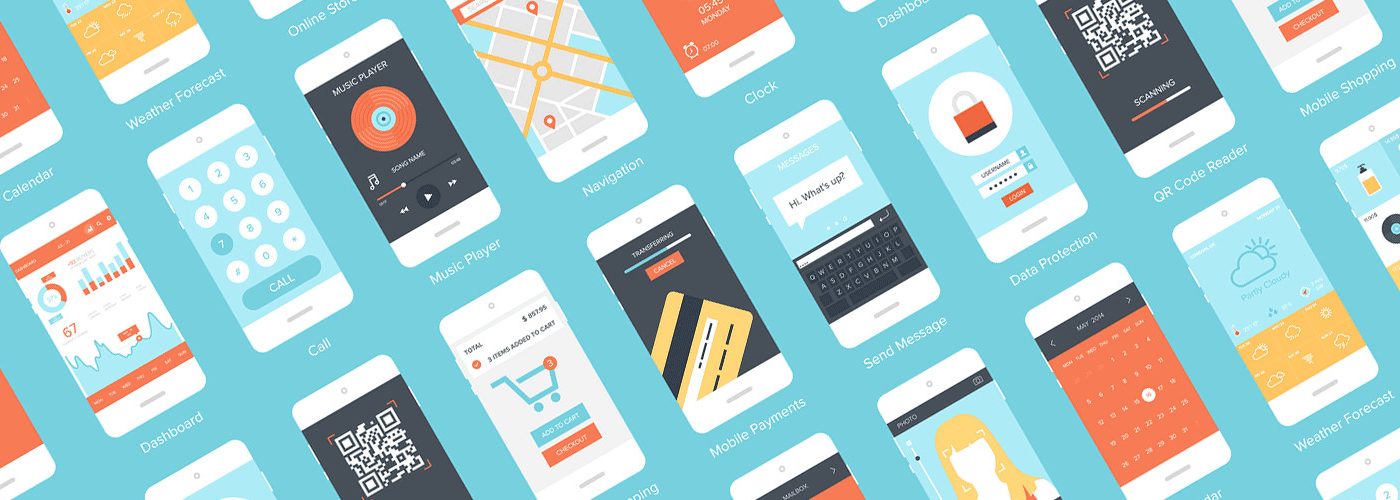
3. Creating an inspiration board: I went out on the web and searched for all kinds of apps that were trying to fulfill the same needs (yes, this is a sort of competitive analysis indeed). To find relevant results, I used various keywords (the broader, the merrier). I created an account for the free apps and used the apps to see what worked well, the design, and what were the features that made the app unique and delivered the most value. The main effort in this step was to understand how I can add value with my app without reinventing the wheel and by listening to the users.
4. Storyboards: A storyboard is a simple sketch that aims to convey an idea; it starts from a problem, a context and a setting to fulfillment of the problem. The goal of the storyboard is not to show UI elements, but to communicate the idea of a product/service. I created 2 storyboards for 2 different use cases, and this is how one of them looked:


As shown in the sketches, a storyboard is not meant to look pretty; the main focus is on communicating the idea quickly, and by using simple sketches you avoid spending time on what is not important. The storyboards give you ideas on how to provide solutions, so it is possible that you come up with many design ideas on how to fulfill a certain need; this is definitely great and highly recommended if you don’t want to get stuck and run out of ideas.
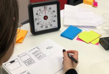
5. Paper prototypes: After storyboarding you are going to have some more concrete ideas on features that you want to include in your app. It’s now time to create some paper prototypes that show a task flow from beginning until end. Mine looked like this:


Again here the focus is not on how to make this look pretty but to convey the main idea and to fulfill a task flow. So use paper and a black marker to work this out quickly.
5. Heuristic evaluation: Nielsen Norman Group (THE usability experts) have created a list of heuristics (or usability rules) that need to be respected when creating an interface. You can view the whole list here . Using those principles, I went through my prototype and looked for violations and missing things that I would improve in the next iteration. I also had my assignment reviewed by 2 peers, which ended up in a list of points to improve (most of them came up because my prototype was too abstract yet, but it did save me time from having to think of all those things myself first). I save the list for future reference and made some improvements on my prototype.

6. Interactive prototype: This was the step where my prototype started becoming more concrete and getting real shape. I chose Axure as a tool to create my prototype as I am well acquainted with the tool and it allows for online publishing and sharing with others. The first version looked something like this (the shadow around the elements indicates clickable components):

After adding some color and some extra functionalities this was the result before testing it with users:


6. User testing: Having completed a first version of the prototype I prepared some scenarios and asked users to perform some tasks using the app. I invited users to speak out loud and say everything they are thinking of without helping them perform the tasks; the goal was to see if they are able to understand what the app is about and if the task flow was clear to them.

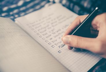
Typically 3–5 users can reveal most of the usability problems; of course each user is different and has different expectations or wishes on what can be accomplished, but the goal is really to fix issues which are the most common among all users. In my case (and in most other cases) I ended up with a checklist of improvements that I could make which can be adapted with low cost as this is just a wireframe. Even if the users are not IT experts, they are a valuable source of information and are always glad to help by providing input and ideas; just make sure you encourage them to do so.
7. A/B Testing: After making some improvements to the prototype suggested during the user testing, I performed A/B testing to compare 2 versions of the app. During the testing users noticed that there was no way to search through the results in the quick update function, so I created 2 alternative designs: one with filter and a search box and one with tabs at the bottom of the app.


I published the 2 versions in Usertesting.com along with some questions regarding the user preferences and some more general questions to get more feedback about the app. User testing is an online platform that allows you to ask feedback from users for your app or website while recording the user’s screen so that you can see how they are interacting with your interface. It’s a valuable source of feedback and highly recommended if you have the budget for it. Once they have tested your interface, you get the recording and you can see their answers to their questions; you can also export data to perform statistical analysis if you have a large sample. In my case, I had an educational promo code so I was only able to test with 4 users and performing statistical analysis would not make sense.

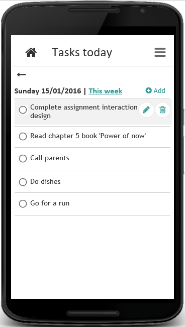
While viewing the results, I came to the conclusion that most users preferred the search function; in fact most users did not see the tabs at the bottom of the screen as they where searching to the top of the page for information. I also received more feedback for my app which was great and ended up in more user stories. I decided to implement the most important ones and my final design result looked as follows:


The prototype is not complete in terms of visual design and branding, but the main items and functionalities are there and serve the main goal of the app, forming thus a Minimum Viable Product. I could have easily overloaded myself from the beginning with decisions about colors, buttons and other things which would have distracted from the main idea and would have little value for the users. By focusing on the most important things I managed to create something that works in the eyes of the users enough to be able to validate if my app makes sense and fulfills their needs.